Panels and Toolbars
While subsequent chapters will dive deeply into the specifics of building and analyzing your models, it is helpful to first establish a spatial orientation of the R-THYM digital twin interface. This chapter provides a high-level overview of the primary panels and toolbars you will use to interact with your system.
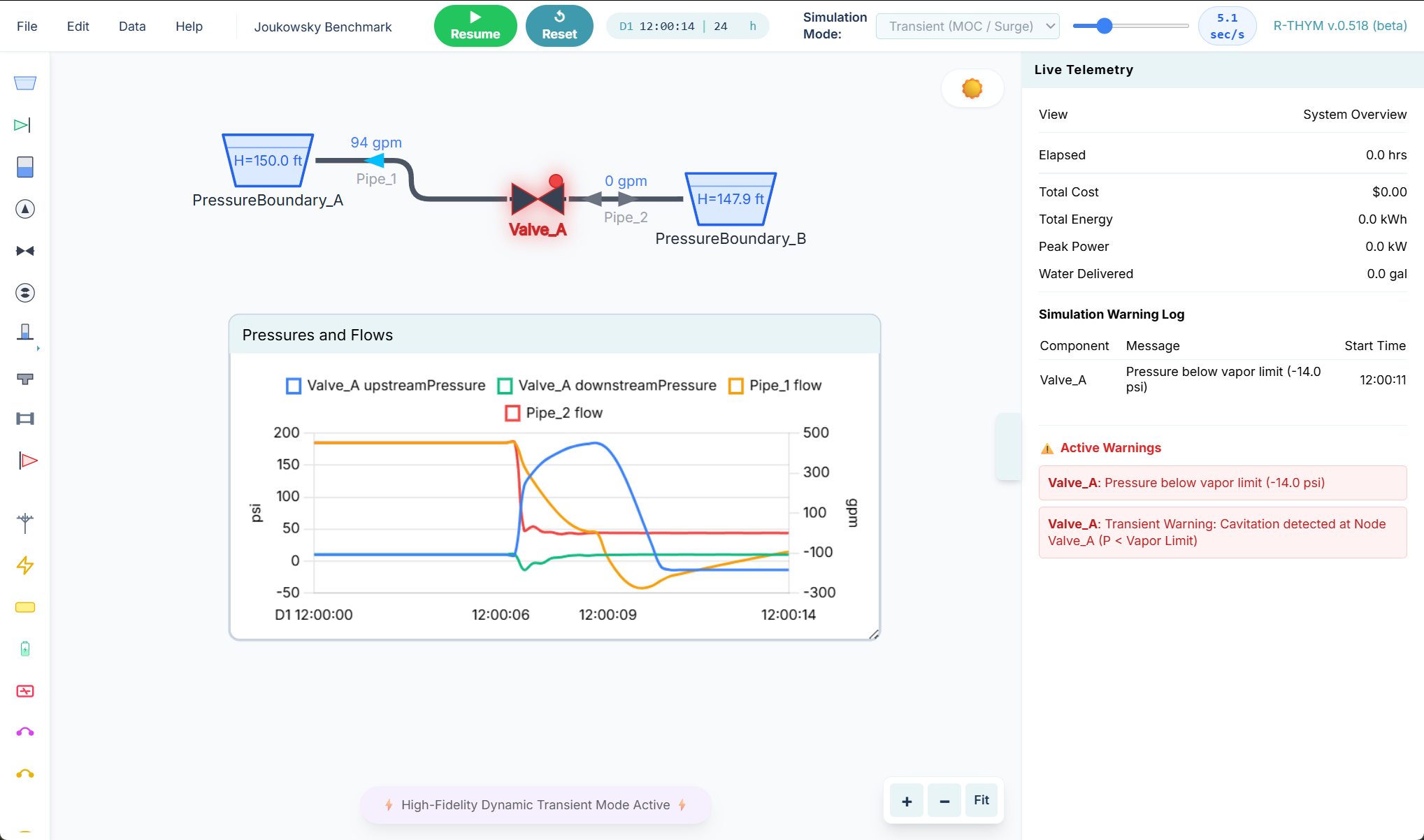
The drawing workspace itself — pan and zoom, dropping nodes, drawing links, canvas charts, and the Weather HUD — is on The Canvas.
The Component Toolbar (Left)
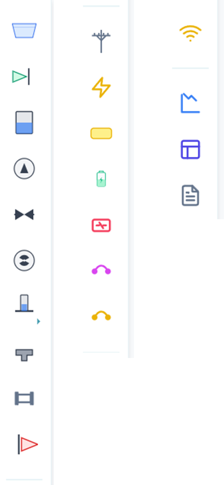
Located along the left edge of the screen, the Component Toolbar is your primary palette for building hydraulic and energy models. It contains all the available physical components (such as Junctions, Tanks, Pumps, Batteries, and Solar Arrays) required to construct your digital twin.
Drag a node from this toolbar onto the canvas to place it. Click a link tool (Pipe, Power Link, Fuel Link, or Control Link), then click two nodes to connect them. The full placement workflow is on The Canvas.
The Telemetry Panel (Right)
The Telemetry Panel, located on the right side of the interface, is the main dashboard for viewing live simulation results, historical charts, and critical system warnings. Its contents dynamically change depending on what you have selected on the canvas.
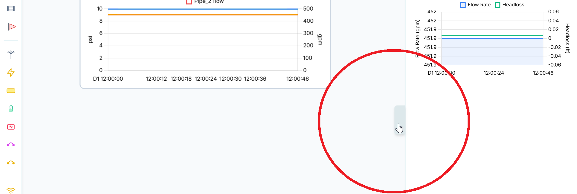
Collapsing the Panel
You can collapse and expand the panel by clicking on the center tab as shown below.
Component Telemetry
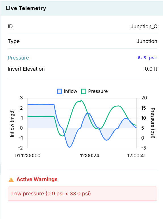
When you left-click on any specific component (e.g., a Pump or a Junction), the Telemetry Panel updates to display its unique data:
- Header: The top section displays the component's name, type, and its most critical real-time outputs (such as Flow, Head, or Power).
- Charts: Below the main outputs, you will find one or more live charts tracking the component's performance over time. Complex components may display multiple charts (for example, a pump might show both hydraulic flow and electrical power draw).
-
Component Warnings: At the bottom of the panel, any active warnings specifically related to the selected component (such as cavitation or low pressure) will be displayed.
System-Wide Telemetry
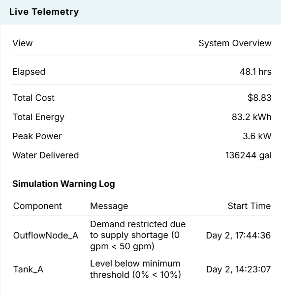
If you left-click anywhere on the blank canvas (deselecting all components), the Telemetry Panel switches to a System-Wide Overview:
- Summary Results: Displays high-level aggregated metrics for the entire project, such as total system demand or total energy consumption.
- Active Warnings: Highlights all currently active warnings across the entire network, ensuring you never miss a critical failure.
-
Warning Log: A historical log of all warnings that have occurred during the current simulation run, allowing you to trace past events even after they have resolved.
The Bottom Chart Panel
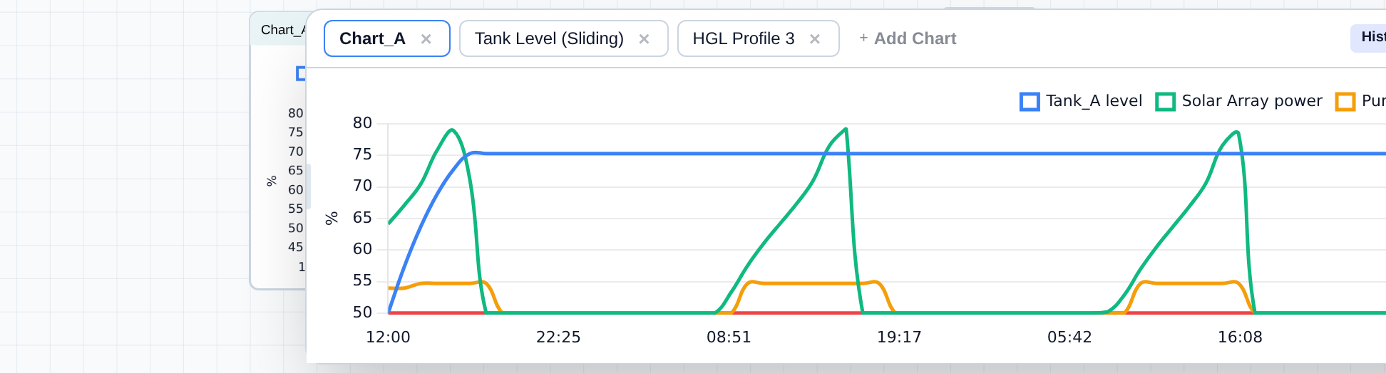
A dockable panel along the bottom-center of the canvas holds any number of extra charts, independent of the Telemetry Panel and of any Chart nodes placed on the canvas. It supports three chart types: a Sliding Chart (rolling real-time window), a History Chart (the full simulation trace), and an HGL Profile (hydraulic grade line and surge envelopes plotted along a pipeline corridor).
Opening and collapsing
- Open: Click the Custom Charts pill at the bottom-center of the canvas. Its badge shows how many charts are active.
- Collapse: Click the chevron (Collapse Panel) button at the right of the panel's header. The pill reappears in its place.
Resizing
- Height: Drag the thin bar along the top edge of the panel. Double-click that same bar, or click Maximize / Restore in the header, to snap the panel to roughly 60% of the window height and back.
- Width: Drag either side edge, or click the width-toggle button to cycle Standard (960px) → Wide (1280px) → Full width.
- Layout: With two or more charts open, click the layout-toggle button to switch between a single chart view and a side-by-side (split) view. Each side of a split view has its own dropdown to pick which chart it shows.
Panel height and width are remembered per browser, not saved in the project file.
Adding, switching, and removing charts
Each chart gets its own tab along the top-left of the panel.
- Click + Add Chart and choose Sliding Chart, History Chart, or HGL Profile. A new tab opens, already focused, and its properties dialog opens immediately so you can configure it.
- Click a tab to make it the active chart.
- Click a tab's × to remove it. This is disabled while a simulation is running, paused, or otherwise locked -- click Reset first.
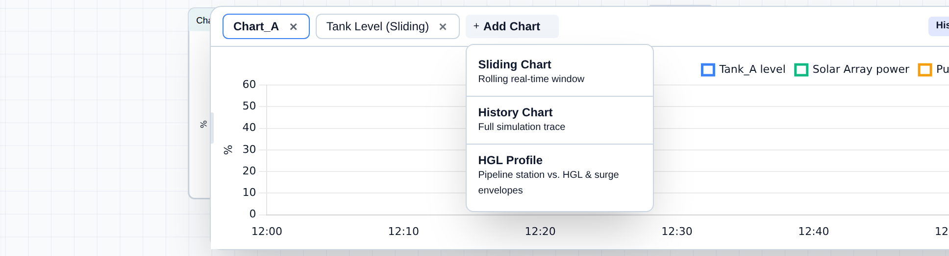
Chart properties: Sliding and History charts
Double-click a tab, or click the gear icon in the panel header, to open that chart's properties:
- Set an optional Chart Title.
- Under Add New Metric, choose a Type (component category), Component, and Metric, then pick the target axis -- Y1 (left) or Y2 (right).
- Click Add to Chart. Repeat for additional series.
- Click Save Changes.
A chart can plot a maximum of two distinct units at once, one per axis. Adding a metric whose unit doesn't match either axis is blocked until a conflicting series is removed.
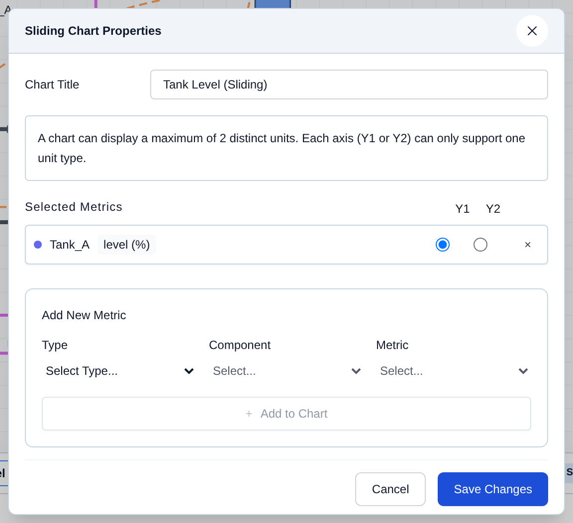
Chart properties: HGL Profile
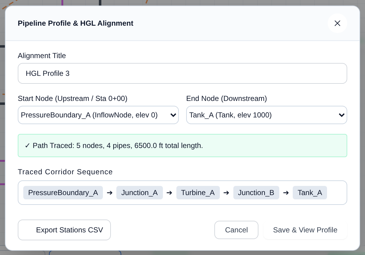
An HGL Profile plots the pipe invert, hydraulic grade line, and (after an MOC run) the transient pressure envelope along a pipeline corridor, rather than a value over time.
- Double-click the tab, or click the gear icon, to open Pipeline Profile & HGL Alignment.
- Set an Alignment Title.
- Pick a Start Node (upstream, Station 0+00) and End Node (downstream). R-THYM traces the connected path between them and lists it under Traced Corridor Sequence.
- Click Export Stations CSV to download station-by-station elevation and HGL data, or Save & View Profile to render it.
[!NOTE] This overview provides a basic map of the interface. In the upcoming "Building Your First Model" and "Running Simulations" categories, we will cover exactly how to configure these components and interpret the telemetry data in depth.