Viewing Data and Visualizations
R-THYM provides two primary ways to monitor your system: the Live Telemetry Sidebar for quick, automatic inspection of individual components, and Canvas Charts for permanent, customized dashboarding.
Live Telemetry Sidebar
The telemetry sidebar on the right provides immediate, automatic feedback. When you click any component on your canvas during a simulation, R-THYM populates the sidebar with its live performance data.
This view is ephemeral and component-specific; it exists to help you quickly inspect system health without needing to set up custom displays. These charts are always set to a "sliding" mode so that they act as a real-time observation window where new data is appended to the right and older data is removed from the left as the simulation progresses. This allows you to track data streams like tank levels, flow rates, pressure, or energy consumption without stopping the simulation.
In the screen capture below, I clicked on the pump to display the live telemetry for it during an EPS simulation.
Canvas Charts
For permanent monitoring, you can add charts directly to your model canvas. These are user-defined tools that persist as part of your project file.
Adding Charts to the Canvas
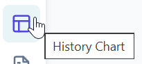
You can drag and drop either a Sliding Chart or a History Chart onto your canvas from the left toolbar.
- Sliding Chart: Displays a fixed time window (e.g., the last 10 minutes). As time progresses, it acts like a scrolling window, appending new data to the right and removing old data from the left.
- History Chart: Accumulates and displays every data point from the start of the simulation, expanding to the right to show the complete temporal trend.
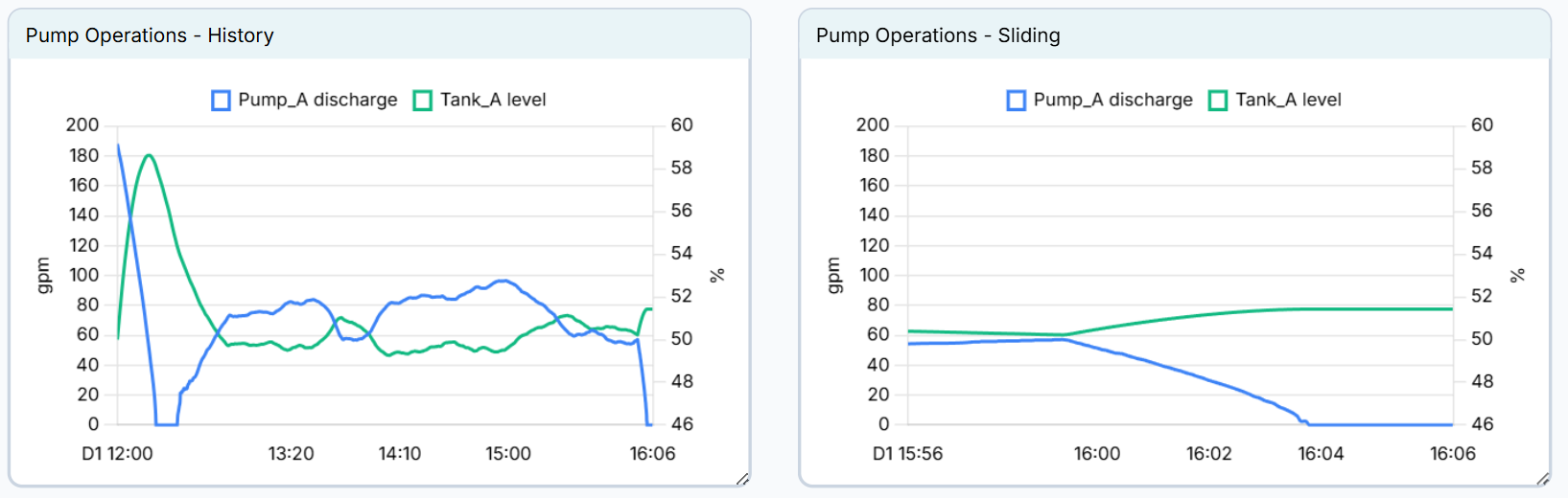
Below is a screen capture showing the 2 different types of charts side by side, linked to the same outputs. As you can see on the sliding chart on the right, the x axis is only 10 minutes long while the entire history is saved in the history chart on the left.
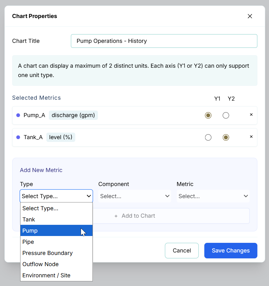
Configuring Chart Properties
While the contents of the sidebar telemetry are automatically determined by the component you select, the charts you place on your canvas are fully customizable. To define what a canvas chart displays, double-click the chart or right-click and select Properties.
Within the Chart Properties dialog, you can:
- Chart Title: Set a custom name for your chart.
- Selected Metrics: Review and manage the metrics assigned to the chart. You can assign each metric to the Y1 or Y2 axis. Remember that a chart can display a maximum of 2 distinct units; each axis (Y1 or Y2) can only support one unit type.
- Add New Metric: Use the dropdown menus to select the component Type, specific Component, and the Metric you wish to track. Once selected, click the Add to Chart button to include it.
Adjusting Sliding Window Size
You can adjust the temporal range for all sliding charts via the Data menu. This setting affects both sliding charts in the sidebar and those placed on your canvas.
- Go to Data -> Chart Settings...
- Enter the desired duration in the Sliding Window Size (minutes) field.
- Click Save Changes.
This setting updates the x-axis duration for every sliding chart in your project, allowing you to zoom in on high-resolution recent activity or broaden your view to see more historical context.
Post-Simulation Analysis: Summary Reports
While charts are effective for live monitoring, Summary Reports (accessed from the Data menu allow you to extract the full dataset for detailed documentation, external reporting, or advanced statistical analysis. Accessed via the Data menu, these reports generate comprehensive archives of your simulation results as a .zip file.
- EPS Summary Reports: Use these to archive operational planning results. These reports aggregate economic metrics like total energy costs, fuel usage, and system-wide min/max pressures. This is the primary method for validating energy efficiency and checking long-term system health.
- MOC Verification Reports: Use these for safety and surge analysis. Because transient events occur in milliseconds, these reports provide the high-resolution, time-series data captured during your MOC runs. This data is essential for verifying that surge protection measures kept pressure spikes within safe pipe ratings.
For detailed information on the specific file formats, JSON structures, and CSV trace configurations generated by these exports, refer to the Data Menu section of this manual.