The Results Menu
After a successful simulation, the Results Menu provides three distinct ways to visualize your system data.
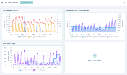
1. System Performance (Time Series)
Clicking Time Series from the Results menu opens the global performance dashboard. This provides a macroscopic view of the entire simulation timeframe:
- Local Weather and ETo: Graphs the live Hourly Temperature, Precipitation events, and calculated Evapotranspiration (ETo).
- Total Water Supply: Graphs the total flow rate (MGD) leaving your reservoirs, separated by Agricultural Supply vs. Municipal Supply.
- Soil Water Balance: Graphs the system-wide average soil moisture relative to Field Capacity and the Permanent Wilting Point, overlaid with total outdoor water deliveries.
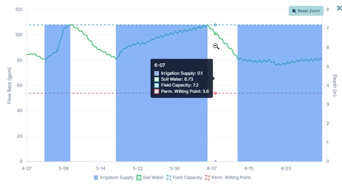
2. Element-Specific Charts
If you want to see exactly what happened at a specific location, you don't use the top menu. Instead, simply click on that element directly on the map after a simulation finishes:
- Pipe Charts: Display the dynamic flow rate (gpm) and velocity (ft/s) traversing that specific pipe over time.
- Node Charts: Display the pressure (psi) and hydraulic grade line fluctuations for that specific junction.
- Area Charts: Display the complex soil-moisture mass balance strictly for that specific polygon, plotting evapotranspiration losses against actual irrigation delivered.
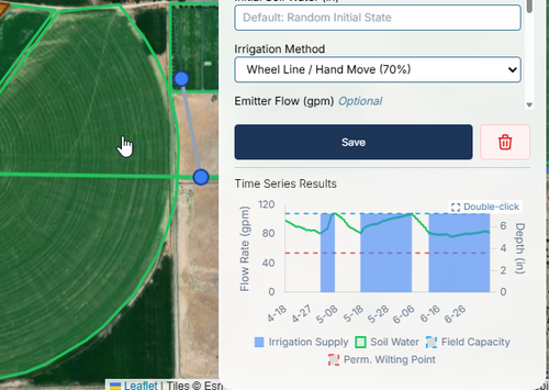
You can also double-click on the chart to enlarge it and zoom in and pan for more details.
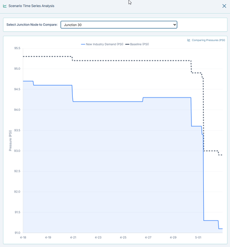
3. Scenario Time Series Comparison
If you have run multiple scenarios, the Scenario Time Series dashboard allows you to plot them side-by-side on a single graph.
For example, you can select a critical delivery junction from the dropdown and overlay its pressure under Baseline conditions versus your New Industry Demand scenario to instantly visualize exactly when and how the performance degrades.
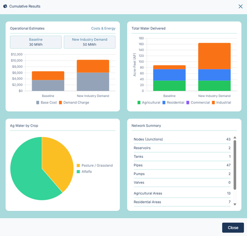
4. Cumulative Summary Dashboard
The Cumulative Summary provides a high-level, executive overview of the entire system's performance across the entire simulation timeframe. It is designed to compare your baseline against your scenarios using multi-bar charts.
- Operational Estimates: Displays the total energy consumed (MWh) and a stacked bar chart of the estimated electrical cost (separated by Base Energy Cost vs Peak Demand Charges) based on your Energy Rate settings.
- Total Water Delivered: A stacked bar chart showing total acre-feet delivered, broken down by end-use (Agricultural, Residential, Commercial, Industrial).
- Ag Water by Crop: A pie chart breaking down exactly where your agricultural water went based on crop type.
- Network Summary: A quick tabular reference of the total number of physical elements (Pipes, Pumps, Nodes, etc.) built into your model.